It can be difficult to get – and maintain – the attention of the board when it comes to risk. Sending them multiple pages full of text is unlikely to engage them in a meaningful way when they’re already juggling other priorities.
Download now: Seven visual risk reporting templates used by risk leaders
So, how do risk leaders catch the eye of their senior leadership team and communicate information about risk more effectively? Representing risk data visually could be the answer.
While the use of heatmaps is common, and often favoured by organisations as a means of presenting their most relevant threats and opportunities, visual reporting comes in other forms and can be applied to aspects of risk management beyond identification. Here are just a few of the ways that risk leaders in our network are taking visualisation to the next level:
1. Heatmaps with control ratings
Many organisations will use a 5x5 risk matrix, with axes of likelihood and impact, to plot their principal risks on a graph - this can help to prioritise certain risks that i) are likely to affect the business; ii) will have the most severe impact; or iii) both.
However, likelihood and impact are just two lenses through which to view risks, and some risk leaders are taking their reports to the next level by adding new dimensions to their 5x5 matrix. For example:
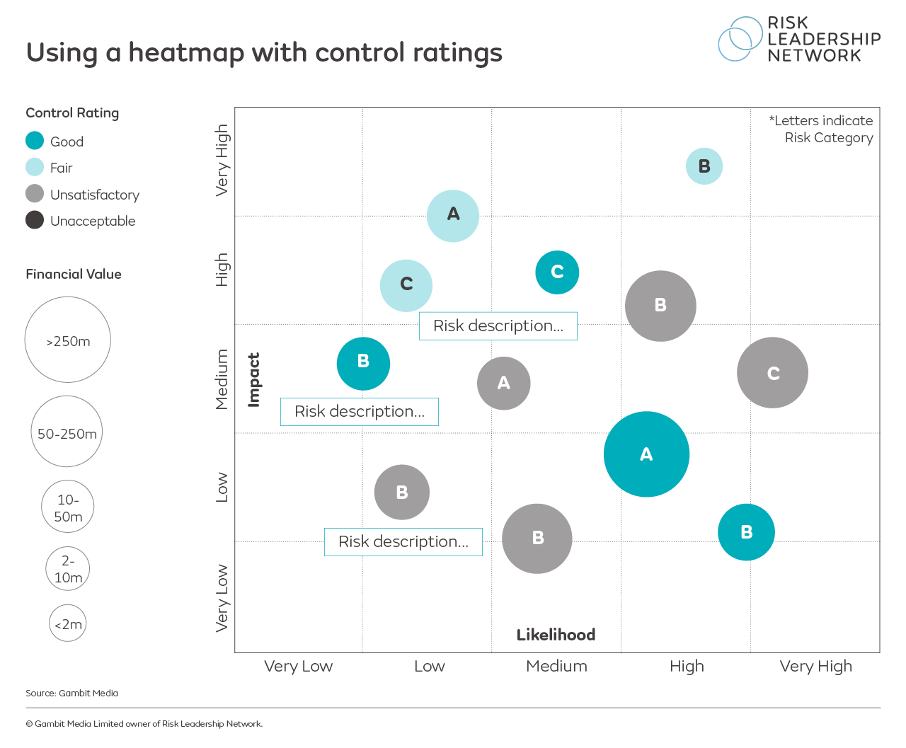
This representation was shared by one of the risk leaders in our network, adding control ratings and financial values to the heatmap. They use a colour code to highlight how well the individual risks are being managed, and a size-code key to illustrate the financial value of each risk. Download this template here.
2. Heatmaps 5x5 matrix with proximity and velocity
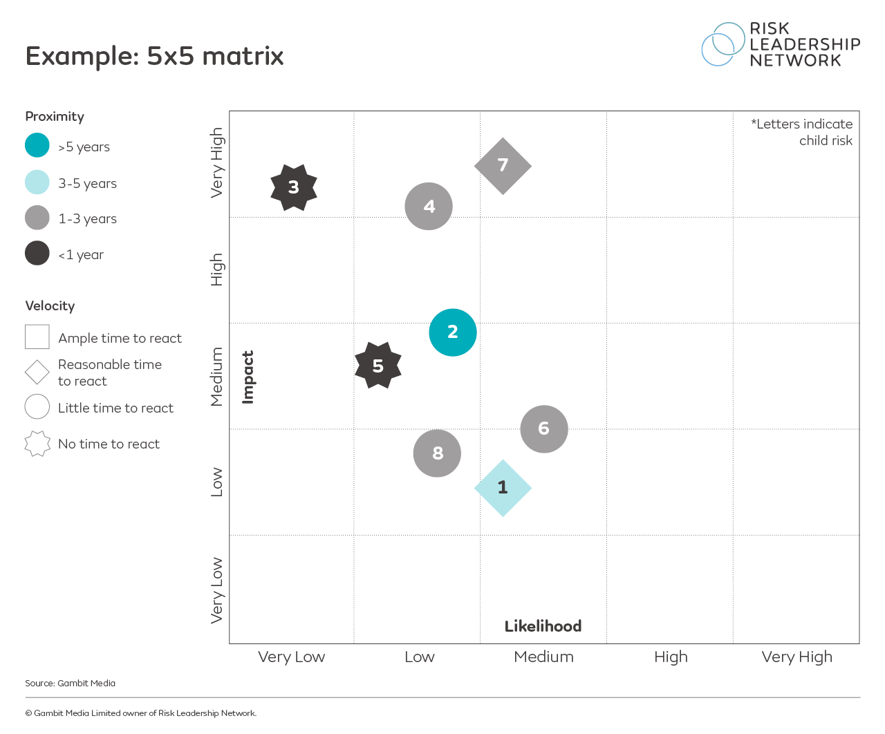
Also shared by a practising risk leader in our network, this heatmap has been enhanced with colour and shape codes to demonstrate the proximity and velocity of their organisation's risks - in other words, how close is this risk to impacting the business? The shape of the risk marker indicates velocity - how quickly is the risk moving?
This is especially useful for monitoring medium- and long-term risks that aren't currently material to the business, but may be in the future if left unchecked. Download this template here.
3. Action-oriented profile
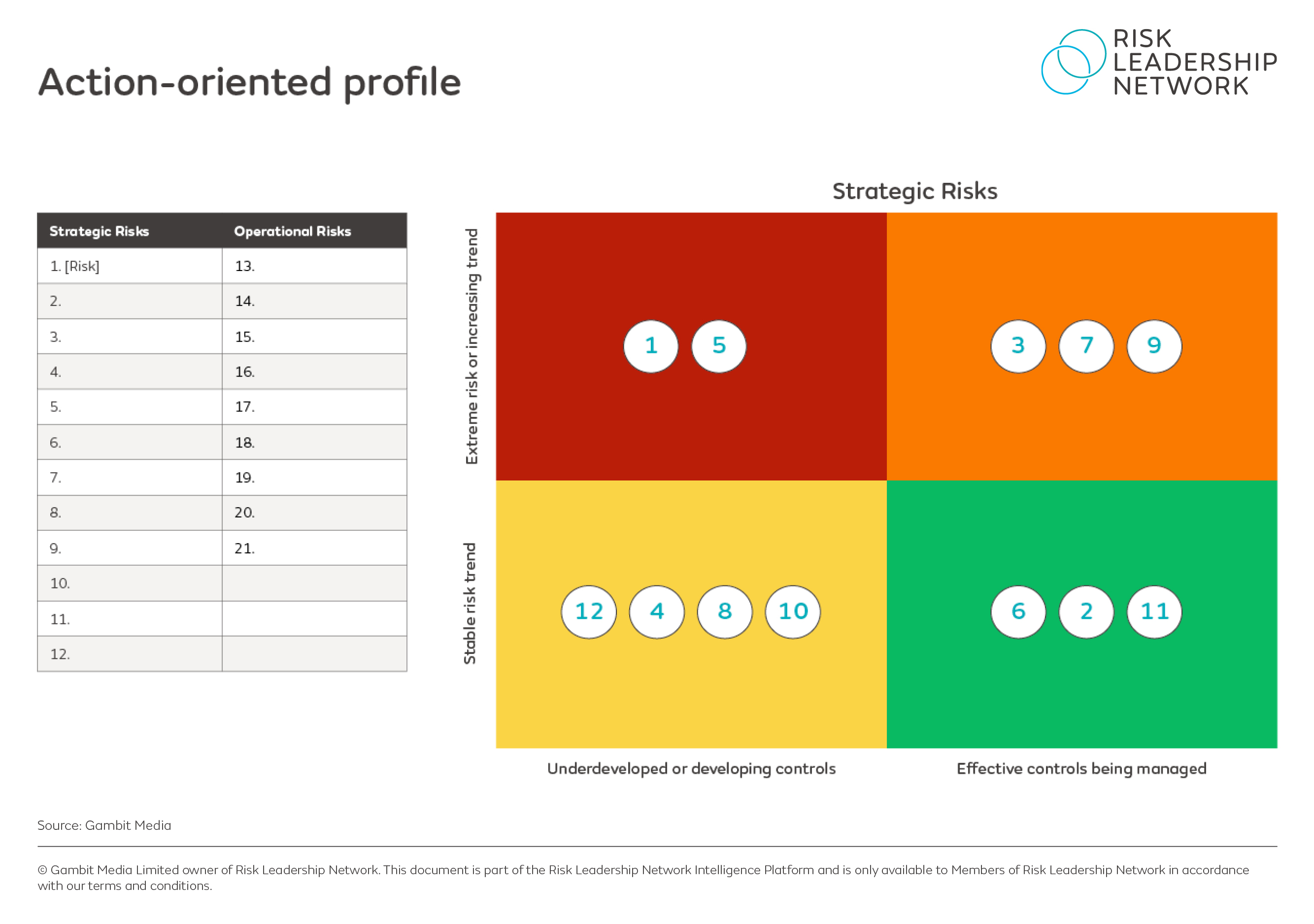
Another risk team explained that they were challenged by their ARC to move away from visuals like bubble charts, with the goal of making conversations about risk richer in detail and impact. This led the team to an action-oriented profile to organise the business' key strategic risks into different categories based on:
(i) whether the risk trend is stable or increasing (y axis);
(ii) whether the controls in place to manage this risk are underdeveloped or effective (x axis).
Ultimately, this focuses the conversation on the risks in the top left corner - these require further action most immediately as the trend is increasing (or the risk is extreme), but the current controls or mitigations in place still need work. Download this template here.

4. Visualising risk appetite using a score card
It can be difficult to link a heatmap of identified risks to other aspects of the risk framework, such as risk appetite, but there are visuals risk leaders are using to make this relationship clearer in their reports.
When setting risk appetite, the business is establishing upper and lower limits for the amount of risk it is willing to take. What business leaders need to know, then, is whether the organisation is currently in scope or not.
One way to present this visually is to use a risk appetite scorecard, which, when combined with a 5x5 matrix demonstrates what risks are approaching the accepted level of appetite and need to be addressed: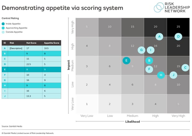
Each risk is attributed a risk appetite score which must not be exceeded, while the placement of that risk on the 5x5 matrix gives a net score which can be compared to the risk appetite score, determining which risks are outside the agreed limits of risk appetite. Download this template here.
5. Demonstrating the spread of risk appetite
A risk leader at a more immature organisation reflects that it can be difficult for an under-resourced team to link a heatmap of identified risks to other aspects of the risk framework, such as appetite.
So they developed a visual that plots the appetite of management:
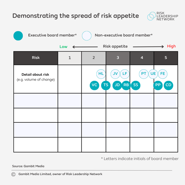
The visual also distinguishes non-executive board members from those who actually make decisions, with the icons representing decision-makers coloured in and non-executives just having an outline.
Download this template here.
Benefit from the shared practical insights of risk leaders on risk reportingJoin our next relevant collaborative member meeting on risk reporting. The insight and templates in this article are a small sample of the practical knowledge shared between risk leaders at a series of member meetings on visualisation in risk reporting. We facilitate regular meetings on specific topics within risk reporting - so let us know your areas of focus, and we'll invite you to the next relevant meeting (subject to qualification). |
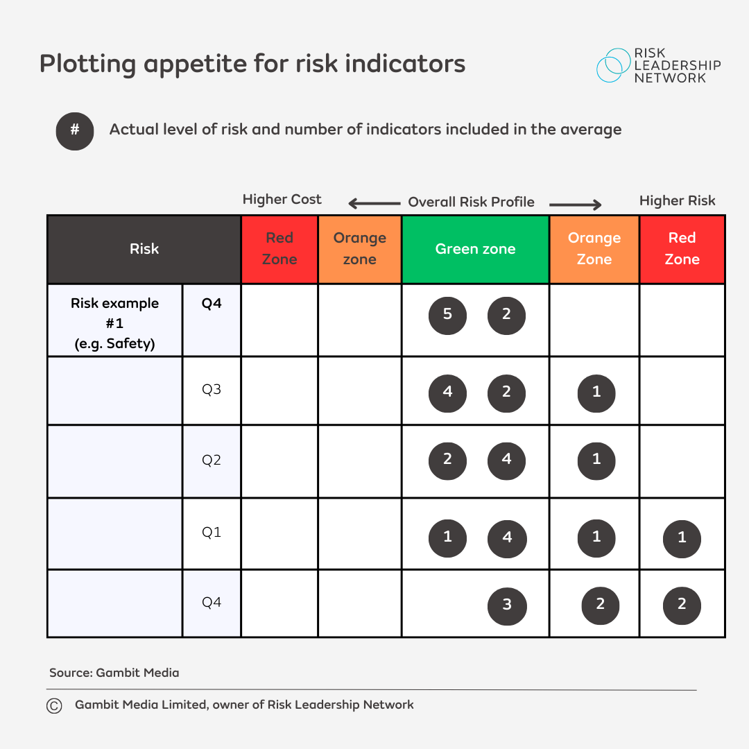
6. Plotting appetite for risk indicators

This is a common method for plotting a business' risk appetite. The indicators are plotted on a spectrum according to i) how costly the risk will be to manage; and ii) how big the risk is to the business.
The chart above is separated horizontally by quarters, including Q1-4 for the current year and Q4 for the previous year; this helps to illustrate that, over time, there has been some improvement, which is important to demonstrate to the board.
Plotting the indicators on a graph like this can help to focus discussions with executives on the ones that are most relevant - for example, there is little point focusing lots of time on indicators that are in the green zone. Instead, risk managers should focus on the indicators in the red and orange zones and try to move those into green. If an indicator is in the orange zone, it should only be there for six months; if it remains there longer (or moves into risk), that would suggest the risk is changing, or that a review of the business' risk framework is necessary. Download this template here.
7. Risk radar for monitoring trends
Another challenge for risk leaders is bringing emerging risks into a report and emphasising their importance to senior leaders - these are not distant threats or opportunities the business can ignore, but risks that should be monitored to see how they develop.
In order to communicate this, it can be useful to plot emerging risks on a radar along with the business' set of principal risks, showing that while emerging risks currently sit in the outer circle, they have the potential to move closer to the centre:
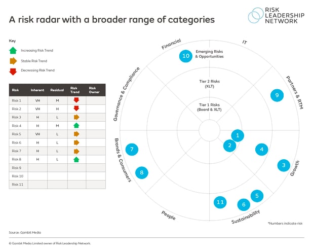
The example radar above, currently being used by a risk team within the network, not only plots their list of eleven key risks risks according to where they currently sit, but also includes information about how those risks are trending - i.e. are they increasing or decreasing in importance to the business?
As the risk leader at this organisation explains, the further away you move from the centre of the radar (which is separated into different categories of risk facing the business), the lower the risk is.
Showing the distribution of risks across different categories, and their proximity to the middle of the radar helps to focus conversations with the board on the highest rated risks that underpin the strategic objectives of the organisation.
8. Create a bow-tie visualisation
Other risk leaders create a bow tie visualisation to distil information in a concise way with maximum impact. Download our in-depth case-study: Creating a bow-tie visualisation for executive committee risks reporting for a step-by-step guide.
These are just a small number of examples shared among Risk Leadership Network members. Through member meetings and network assistance opportunities, our members have been sharing their different approaches to visual reporting. There are far more examples available on our intelligence platform, as well as tailored, regular peer-to-peer knowledge sharing opportunities for members based on their organisation's individual risk priorities.
As well as case studies and example templates, risk leaders have also shared how they use external software to make their own tailored graphics, as well as how they leverage the Risk Reporting Comparison Tool to help visualise and validate their approach to external reporting.
| Would you like to leverage the practical experience of risk leaders at the world's leading organisations in your risk reporting? >> Request to attend our next risk reporting meeting |
Share this

Key considerations for enhanced risk reporting

Reporting risks in smarter ways - our Risk Reporting Comparison Tool