Request a demo

Risk Reporting Comparison Tool

Inspired by a series of member meetings on risk reporting, this Risk Leadership Network tool helps risk managers understand how other companies are reporting their principal/material risks in annual reports. The tool currently presents, and runs intelligence on, all risks reported by every FTSE 100 company, plus others in key sectors.

Request a demo

RRCT1

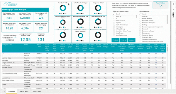
Validate your approach to reporting

Compare and benchmark your reporting approach by understanding what information other companies in your industry include in their annual report, and how it's presented, through an objective set of data points.

RRCT3

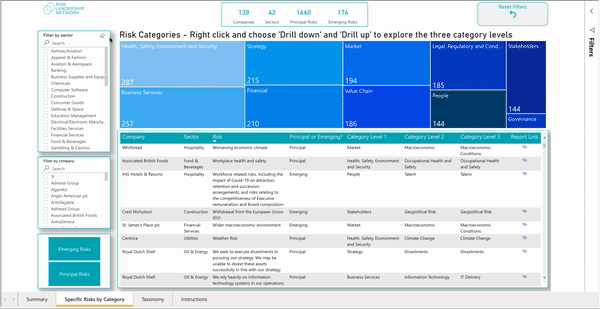
Explore specific risks by category

Drill down into the specific risks reported by over 130 companies using a three-level category taxonomy agreed on by a range of senior risk leaders, with optional filtering by sector, company and risk type.

RRCT2

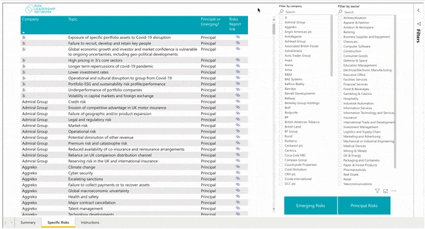
Review the emerging risk landscape

Find out what emerging risks other companies are listing in their annual reports and see how your own analysis stacks up. This is now complemented by our dedicated Emerging Risk Tool (more info on this here).

See the tool in action

FAQs

How did the idea for the Risk Reporting Comparison Tool come about?

The genesis of this tool was a member meeting in 2021 which focused on the challenges risk leaders face while writing their annual report. Several members noted that one of the main difficulties they encounter is comparing information – for example, how the risks reported across a sector are changing year-on-year.

Creating the Risk Reporting Comparison Tool was an excellent opportunity to help members overcome this barrier, as well as saving them time and energy they can invest elsewhere.

What value does comparing the risks reported across different companies and sectors create for risk leaders?

Having tangible and objective data that you can take to your executive committee can be very helpful, in terms of adjusting their expectations and showing how other companies are reporting their chief risks.

Further to this, the holistic overview of reported risks offered by the tool can highlight to risk managers what they are missing from their annual report or – alternatively – give them confidence that they are moving in the right direction.

Which companies are shown in the tool, and is this based on location or the size of the company?

As with our other tools, listed companies in the UK from the FTSE 100 are highlighted in the dashboard. In addition to this, we have built out a few key sectors of the FTSE 250.

More recently, as part of our ongoing iteration and development of the tool, we have added ASX 20 companies from Australia.

Can you explain what the tool’s main dashboard shows and how this information may be useful?

The dashboard summarises how much companies are writing about risk in their annual report – in terms of word and page counts – and whether or not their reporting includes certain qualitative and quantitative data. For example:

  • Does the report categorise risks?
  • Are key risk indicators included in the report?
  • Does the risk section of the report include a viability statement?

The dashboard can also be filtered by individual company and sector, allowing members to conduct a much more granular comparison of the risks being reported against their own.

In what ways have members found this tool useful?

We have had positive feedback from members on this tool, with some reporting that they pulled data from it to make the case for including or excluding certain information in/from their latest annual report.

For example, one member went to their senior leadership team to ask whether they could exclude the likelihood-impact matrix, and was able to use the fact that only 25% of companies include this to support their argument.

The main response from risk leaders, however, is this that tool is saving them a significant amount of time gathering data and then finding a way to easily compare it, with all of this functionality now located in one place – the Risk Reporting Comparison Tool.

How do you plan to grow this tool in the future?

The next step is to expand the geographic reach of the tool to cover companies and data in additional territories – for example, we are hoping to include companies from the Middle East in the next version of the tool.

We are also open to members’ continued feedback and will try to add any new data points the network would like included.

Back to top