Risk Reporting Comparison Tool
Does validating and sense-checking your annual report take up too much of your risk team's time?
.png?width=1080&height=1080&name=Untitled%20design%20(2).png)
Watch this short video to see how it works:
Please note that we only have the resources to give demos to prospective members - practising risk leaders at large non-financial organisations in Europe, Australasia and the Middle East.
Request a demo

Validate your approach to reporting
Compare and benchmark your reporting approach by understanding what information other companies in your industry include in their annual report, and how it's presented, through an objective set of data points.

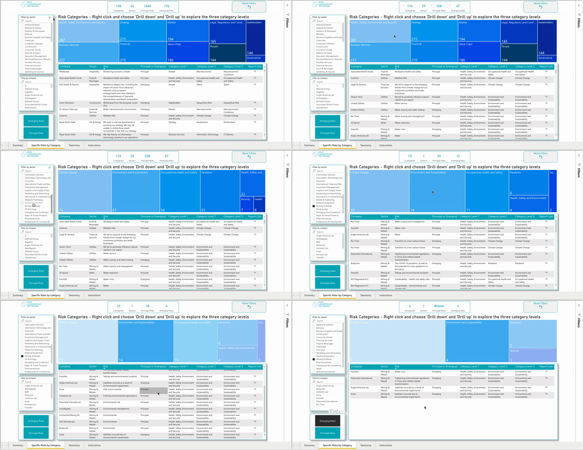
Explore specific risks by category
Drill down into the specific risks reported by over 700 companies using a three-level category taxonomy agreed on by a range of senior risk leaders, with optional filtering by sector, company and risk type.

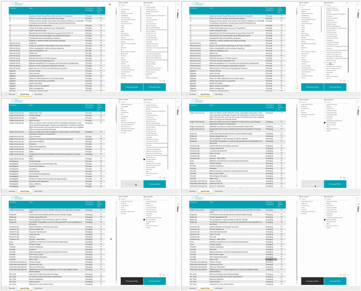
Review the emerging risk landscape
Find out what emerging risks other companies are listing in their annual reports and see how your own analysis stacks up. This is now complemented by our dedicated Emerging Risk Tool (more info on this here).
How does it work?
FAQs
In 2021, one of our members (a CRO at a FTSE organisation) shared their concerns about their annual report.
One of the main difficulties they encountered was comparing information – for example, how the risks reported across a sector are changing year-on-year. Their risk teams had to trawl through hundreds of company websites and reports to get enough information to sense check and validate their annual report.
We created the Risk Reporting Comparison Tool to help solve this problem for this specific member.
But the tool had wider appeal, and many risk leaders began to rely on the tool. Each member organisation has their own requirements, so we have continued to develop the Risk Reporting Comparison Tool, each iteration in line with a specific request from a member. For example, in August 2023, we added data from 500 US companies for a member whose organisation is soon to be listed in the S&P500.
Having tangible and objective data that you can take to your executive committee can be very helpful, in terms of adjusting their expectations and showing how other companies are reporting their chief risks.
Further to this, the holistic overview of reported risks offered by the tool can highlight to risk managers what they are missing from their annual report or – alternatively – give them confidence that they are moving in the right direction.
FTSE, ASX, S&P500 listed companies, as well as large privately owned organisations.
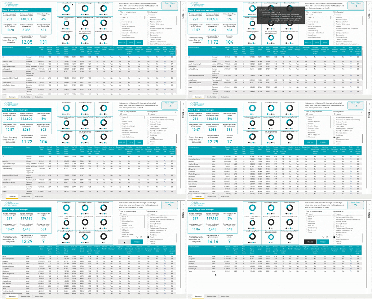
The dashboard summarises how much companies are writing about risk in their annual report – in terms of word and page counts – and whether or not their reporting includes certain qualitative and quantitative data. For example:
- Does the report categorise risks?
- Are key risk indicators included in the report?
- Does the risk section of the report include a viability statement?
The dashboard can also be filtered by individual company and sector, allowing members to conduct a much more granular comparison of the risks being reported against their own.
We have had positive feedback from members on this tool, with some reporting that they pulled data from it to make the case for including or excluding certain information in/from their latest annual report.
For example, one member went to their senior leadership team to ask whether they could exclude the likelihood-impact matrix, and was able to use the fact that only 25% of companies include this to support their argument.
The main response from risk leaders, however, is that this tool is saving them a significant amount of time gathering data and then finding a way to easily compare it, with all of this functionality now located in one place – the Risk Reporting Comparison Tool.
We will continue to develop the Risk Reporting Comparison Tool to meet the specific requirements of our members.